Design Tips for Making Eye-Catching, Professional Ads for Sex Workers
 By Tehcaffeinator
5220 views 26th Aug 2021
By Tehcaffeinator
5220 views 26th Aug 2021
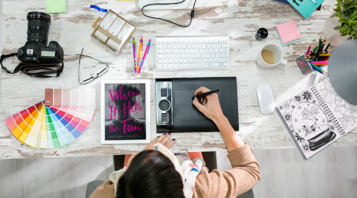
As sellers, listings and ads are the first and biggest representation of who we are to prospective buyers. The goal is to have enticing photos that make the buyer stop scrolling or searching and send us a DM. I have been dabbling in graphic design for some time now, and I’m here to pass on a few tips that I’ve learned along the way.
First, you’ll need to start with some great photos. I HIGHLY recommend investing in a ring light with a tripod/phone holder and a remote – If I lose my remote (which I do, constantly), I won’t even bother trying to take pics until I find it. Make sure your photos are well lit and not blurry. More than likely, you already have this down to a science - I've seen plenty of other blog posts about photography.
Go through your photos and edit them to adjust saturation, warmth, and contrast before you start creating your ad. Every now and then I’ll use photos from multiple shoots – you want to make sure they have similar warmths (“warm” indicates a more yellow/orange hue, and “cool” refers to hues with blue/purple in them). It’s a small touch that adds to the cohesiveness of your finished ad.
Once you have some bangin’ photos to choose from, remember ”CRAP” – Contrast, Repetition, Alignment, and Proximity. We’ll go over each of these in a sec. If you haven’t already downloaded SparkPost – get on it! I use it for almost every single ad I make, and I also use it to watermark all my photos! There are so many great design tools to play within this free app (I promise they’re not paying me).
For a professional photo editing app, I love using SnapSeed but there are probably hundreds of good editing apps out there for free. If you’re looking for gorgeous free stock photos for backgrounds – UnSplash is bae.
Okay, onto the CRAP!
Contrast
This is not the same as adjusting the contrast of a photo – it means the differences between your design elements need to be big – if two elements are similar but not quite the same, the eye will immediately be drawn to the not-quite-the-same elements and it distracts from your message.
What are some examples of design elements, you ask? Color, size, font style (serif vs sans serif), font weight (meaning bold or light), spacing, and alignment! For instance, pair BIG BOLD TYPE with small, thin type. Be careful with serifs (the little “thingies” on the ends of some letters – ATW uses a sans-serif font), as they can really distract the eyes if not used correctly in conjunction with sans-serif fonts (I still struggle with serifs sometimes, they are tricky little fellas!).
Color is also a very important element for contrast – the most basic of examples would be pairing white text with a black background. If you don’t create enough contrast your text could be hard to read. If you have a patterned background, be sure to have the text highlighted with a contrasting color – SparkPost makes this super easy!
Repetition
This is how you tie everything together. It just means using consistent formatting and repeating elements throughout your design. Remember serifs? You can definitely use a bold serif font paired with a light sans-serif as long as you do it consistently and have enough of a contrast between the two fonts.
You can take things a step further – some of the most clean and professional ads I’ve seen are from sellers who use the exact same format every time – you’d think it would get boring, but if you were to look at their profile as a whole, that kind of repetition can really make them stand out as a seller. Personally, I love to mix things up and get a little wild with every ad I make – but either is fine! Find your own “brand,” if you will. Another cool thing about SparkPost is that you can open up a completed design, quickly swap out the pics and text and BAM, you just made another ad.
Alignment
No, I’m not talking about being chaotic neutral – this refers to carefully arranging your elements in a way that makes sense. Most beginners tend to center everything on the page – and while this can look okay, you’re missing out on creating a strong visual line that will draw the eye. Try aligning everything to the left or right, and don’t be afraid of leaving negative space! Negative space is another design element in itself – treat it that way. Too much text or too many photos crammed into one design makes my poor ADHD brain hurt. Decide on a simpler, shorter message, or put all the relevant details into the description of your listing. Less is more sometimes!
Proximity
Proximity simply means grouping related design elements together. If they go together – don’t keep them apart! If you are making a listing with multiple categories of items on it, you’d want to group all the items in each category together and leave plenty of negative space between the groups. If you have successfully used proximity, each grouping you make becomes a cohesive visual element and reinforces the principles of contrast and alignment. Just as you’d start a new paragraph with each change in topic, this distinction greatly increases the readability of your ad.
Hope you enjoyed learning about CRAP! I feel like I barely scratched the surface of the fundamentals of design, so look for more blog posts from me in the near future! Also, if you have any questions or want someone to look over an ad for you, my DMs are always open for fellow sellers and I don’t charge any kind of fee (tips would be appreciated but not expected!).
xoxo - Liv/tehcaffeinator
By Tehcaffeinator
Thanks for visiting my profile! 🖤If you visit my profile and like what you see, don't hesitate to send me a friend request or a DM! My favorite part of the...
Interested in contributing to our awesome community blog? Why not get in touch with our friendly team?
More From Our Blog

The Science Behind Why Used Panties Smell So Good
Why are used panties so intoxicating? Why are some more addictive than others? Is it weird to like them? Let's get nerdy! In this blog, I’m going to explore The...
Seller Used panties Sellers’ Perspective
How Selling on All Things Worn Helped My Mental Health
I joined this site just over six months ago to earn some extra spending money and to explore and test my sexual boundaries. What many people don’t realise when they...
By DesireNoMore
Seller

Latest Blogs
Faceless, Curvy and Still Figuring It Out: My First 2 Months On All Things Worn
By LylaRose_
How Adult Work Helped Me Pay My Vet Bills
By Tabbywildwood
Selling Adult Content While Being a Full-Time Single Mum
By AllThingsPeach
Sub/Dom Relationships: How Do You Make Them Work?
By XoxoBlondie26
How To Stay Safe On All Things Worn
By PetiteBlondeLiv
View All Blogs
Follow Us
Keep in the loop with everything happening on All Things Worn.

Categories
Used UnderwearUsed Shoes
Used Hosiery
Used Clothing
Naughty Extras
Instant Content